Novo Connection has a mission of transparency, bold, innovation and the brand reflects this.
The brand positions itself not as a traditional risk-averse insurance vendor, but as an innovator and challenger: technology-enabled, data-driven, and tailored for brokers and employer clients who don’t just accept the status quo. The brand voice had to feel confident, forward-leaning, and differentiated from other stuffy insurance companies.
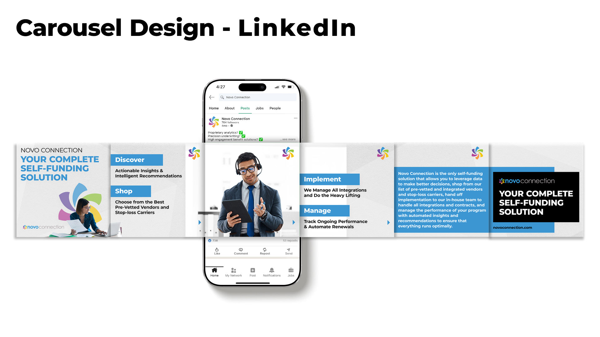
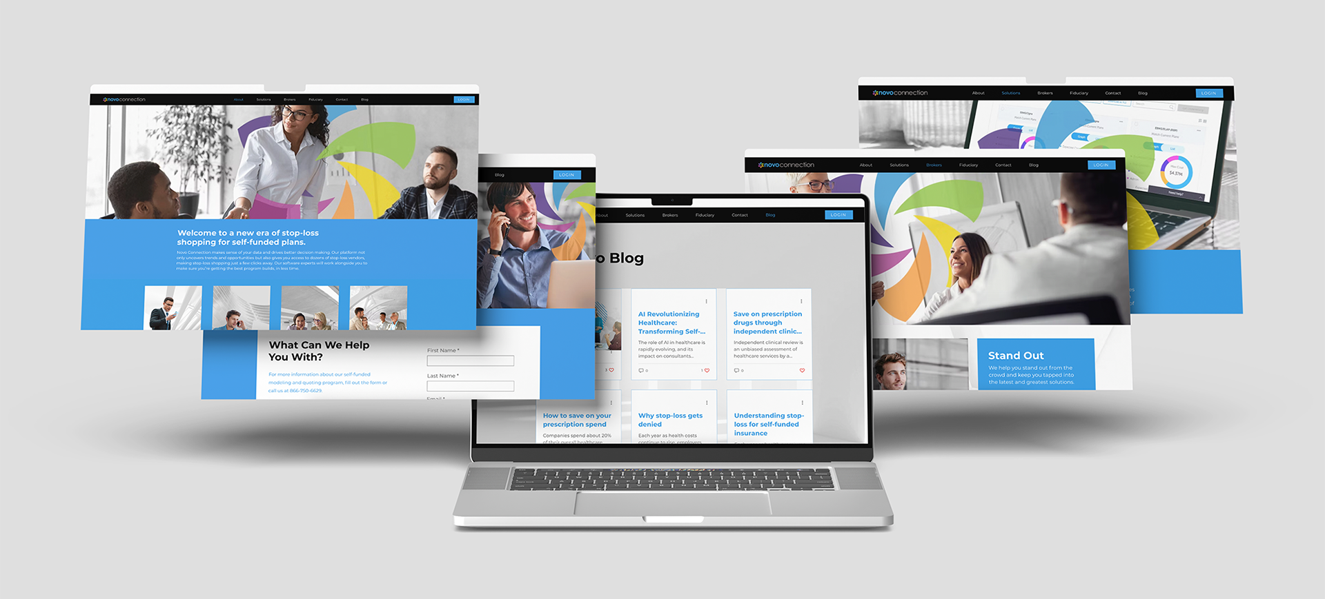
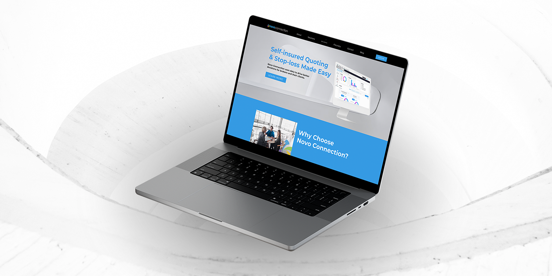
The website had to match that attitude: sleek, modern, tech-savvy—and clearly communicate complex solutions in an accessible, action-oriented way.
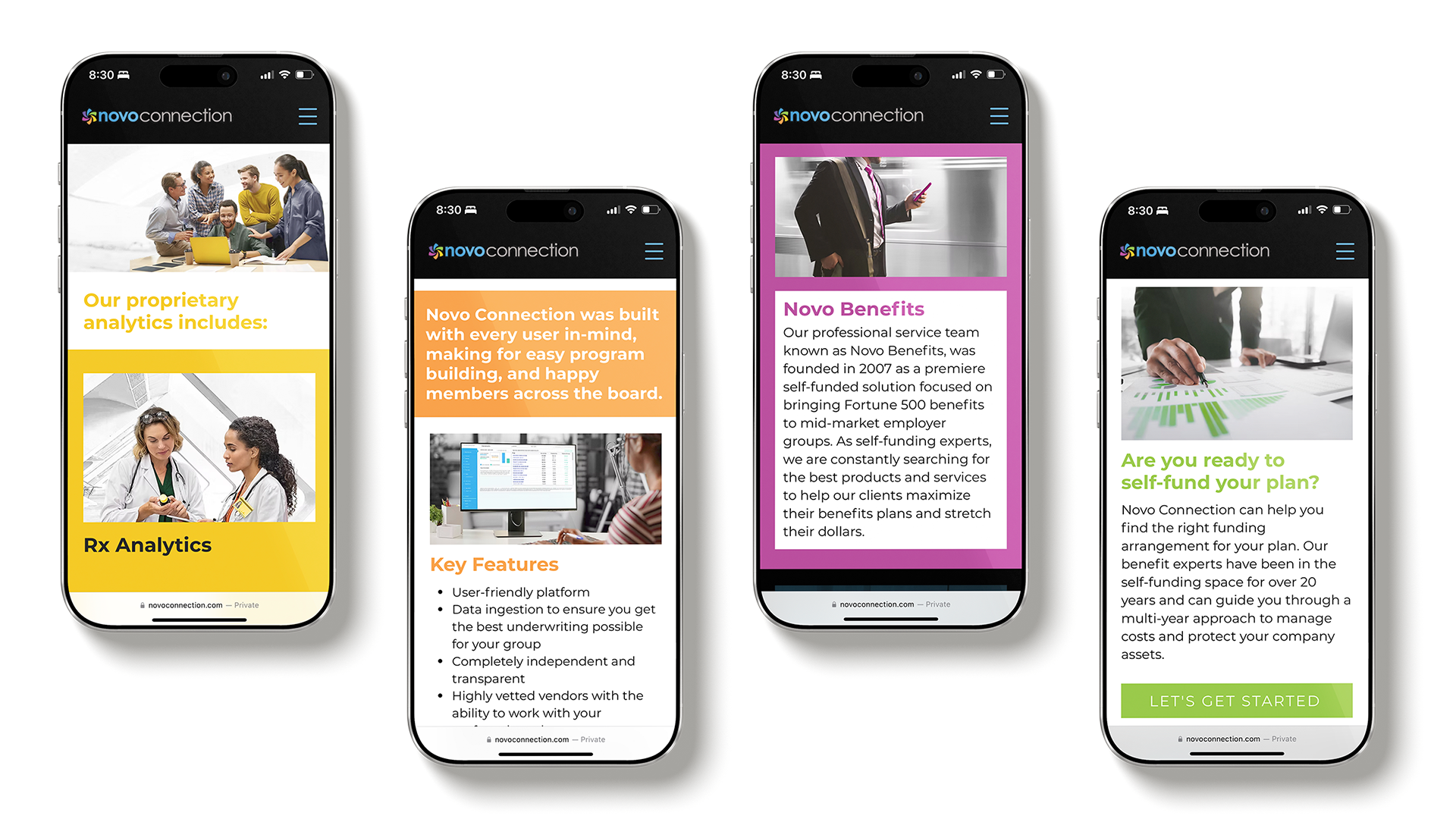
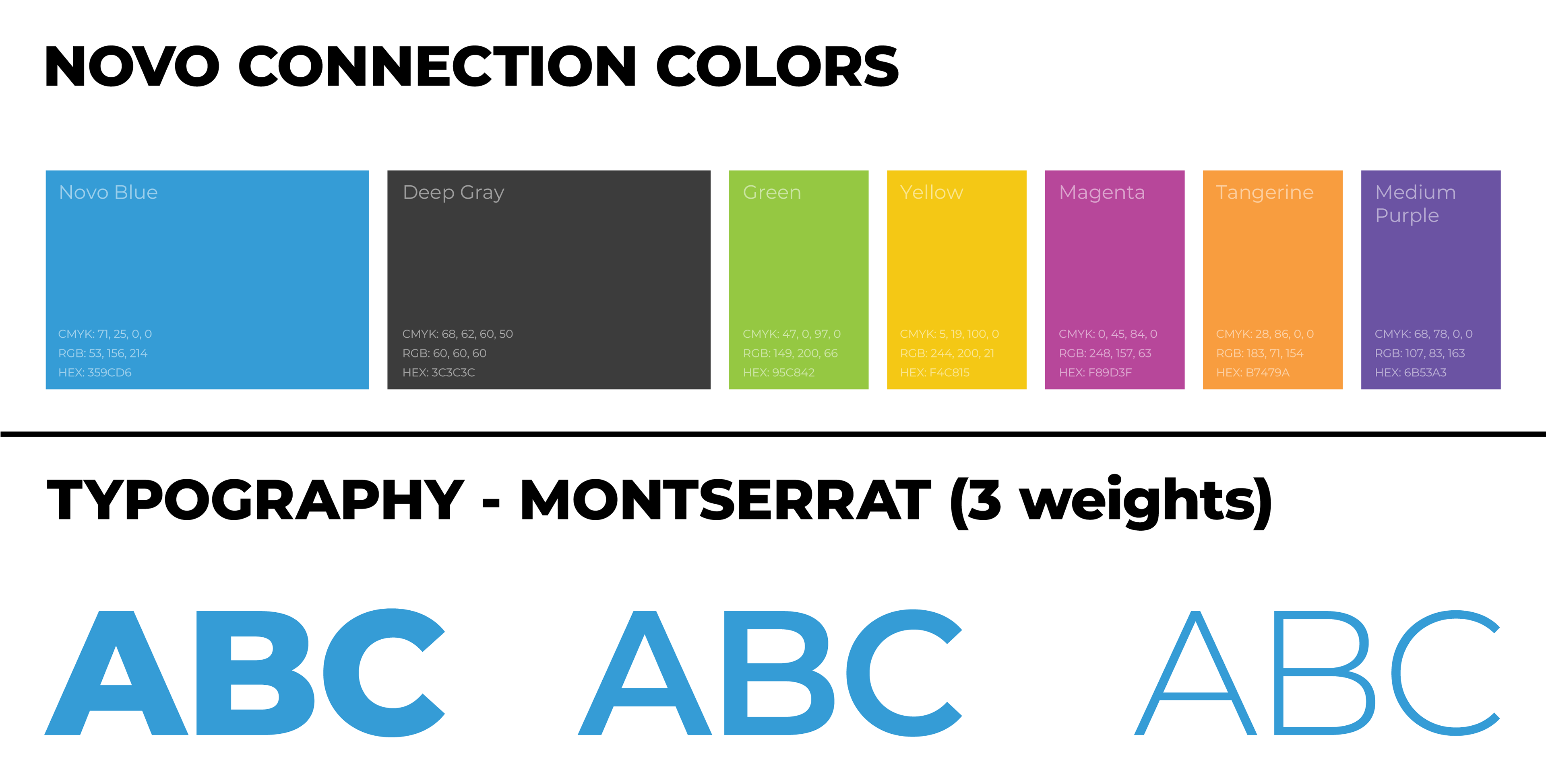
The Novo Connection colors represent the passion for helping people, the quality of service provided, and the respect we have for our customers. The color criteria is grayscale with pops of brand colors to stand out in the insurance industry.